
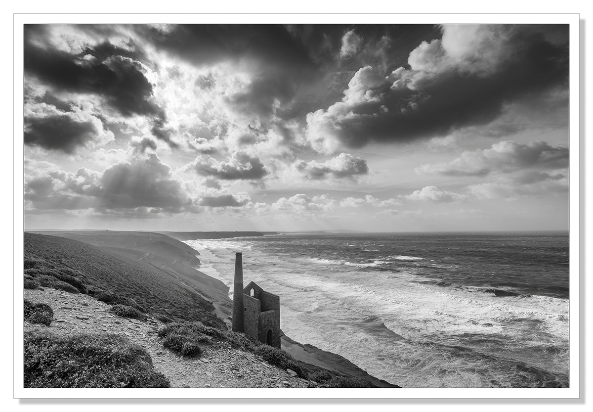
Wheal Coates Revisited Once Again..
I found myself at Wheal Coats again this week. A severe gale was blowing making it very difficult to stand. It was the tail end of a hurricane I believe. With my tripod blowing over before I’d had chance to attach my camera you should get some idea of just how windy it was.
However, I did manage to take a couple of pictures. I will now ask the question often asked in photography blogs, black and white or colour? I’ve taken this shot before at 24mm. The black and white version won first in a Nikon photography competition so I am drawn to the black and white image but I’m also very drawn to the greens and blues in the colour version. I do like the way the wider angle lens has given this version of the picture a greater sense of space.
I guess I don’t have to choose, you don’t have to choose either, I hope you can enjoy both pictures but I would be interested in your opinion just the same. Click on the images for a clearer sharper view.. :-)
 15mm f/11 1/320 sec. ISO-100

 15mm f/11 1/320 sec. ISO-100

![]()


I must say that I like the black n white But in this case the color wins.. :) magnificent!
October 23, 2014 at 7:59 pm
Thank you so much Katarina! :-)
October 23, 2014 at 8:16 pm
Both are great but I do prefer the Black and White version.
October 23, 2014 at 8:09 pm
Thank you Neil!
October 23, 2014 at 8:17 pm
Wonderful photo!
October 23, 2014 at 8:11 pm
Thank you very much Harrie!
October 23, 2014 at 8:17 pm
Colour, very nice shades.
October 23, 2014 at 8:17 pm
Thank you Wendy! :-)
October 23, 2014 at 8:17 pm
Love that sky! I do see what you mean about being drawn to the greens in the colour version but I also wonder if that very aspect somehow divides the image?
October 23, 2014 at 8:27 pm
Hmm, thanks Sarah. I think the coastline presents us with a big divide between land and sea which is perhaps emphasised more in the colour version. I guess the black and white version does manage to merge land and sea into a more cohesive whole with eveness of tone. Interesting thought. Thank you. :-)
October 23, 2014 at 8:55 pm
There’s quite a marked tonal divide in the sky itself in the colour version too. I think that’s what struck me the most!
October 23, 2014 at 9:44 pm
Thanks Sarah.
October 24, 2014 at 6:47 am
Do you not feel Sarah that maybe this divide in land and sky (it is over the land that clouds often gather) creates a tension in the photograph more likely to engage a viewer of the picture? As Jude says, she likes the black and white as it evens out the tones yet it’s the colour version she keeps returning to. I’m having similar reaction to Jude, when I was preparing these images, I was all for the black and white. That was the image I was going to post but I kept returning to the colour picture so I decided to post that one too.. :-)
October 24, 2014 at 7:49 am
I wonder if I hadn’t seen the monochrome whether the division in tones in the colour version might not have appeared to be so marked! A lot of the strength in the colour version is in the right side of the image as I see it. I feel like I want the top left corner to be more punchy.
October 24, 2014 at 10:47 am
With your comment Sarah and Noeline’s, clearly I should have increased the saturation and vibrance but used a mask to just affect the change on the left. It’s been a useful discussion! Balancing what we see with what our camera sees is always tricky, especially in Landscape photography where light is falling differently on different parts of an image. I remember one of the RPS associate panels recently was criticised for creating unnatural greens in the areas of his landscapes where the sun was shining. The greens were quite natural in the shaded areas. :-)
October 24, 2014 at 11:49 am
It’s hard to tell if you’ve got the balance right sometimes! There’s also the difficulty in looking at the image from a purist photography aspect and that of a piece of artwork. Having come to photography from being a fine art painter I think I very often look at a scene and the image in respect to how I would like to capture its essence in paint. The truth of a scene caught on camera is very often not quite what our eyes have seen. The question then is whether it should be altered in processing or not. I know lots of people dislike heavily processed images but I always come back to my ethos of painting with light. I’m creating art rather than documenting a scene. I think I’m probably in for many interesting debates with others at RPS on the subject ;-)
October 24, 2014 at 4:52 pm
If you’re working in the Visual Art, now Creative category, at the RPS, you’ll be amongst like minded individuals Sarah so no worries there. I’m looking forward to seeing your panel when it’s done. :-)
October 24, 2014 at 6:14 pm
Yes, it’s going to be great! Creative wise I want to create a panel all centred around my love of abstract light painting :-) I really enjoy some of the simple pieces I do but I want to expand on the basic conceptions.
October 24, 2014 at 6:46 pm
It all sounds very interesting Sarah. I wish you luck with it. Have you been to an advisory day?
October 24, 2014 at 7:55 pm
Not yet! I really need to sort that out.
October 24, 2014 at 8:04 pm
Definitely worth doing. They’ll ensure you’re on the right track! :)
October 24, 2014 at 8:20 pm
Yes, I don’t want to start my projects without the input!
October 24, 2014 at 9:37 pm
You should take some work with you when you go Sarah. Put a panel together, following the guidelines you can download from the RPS website and they will assess it and advise you if changes are necessary. For the LRPS you need to show a variety of content and technique.
October 25, 2014 at 6:45 am
The hardest part is choosing! I have plenty of variety which is good :-)
October 25, 2014 at 11:25 am
Both are gorgeous.
October 23, 2014 at 9:07 pm
Thank you MaryLou!! I’m glad you enjoyed them both! :-)
October 23, 2014 at 9:21 pm
Wonderful B&W
October 23, 2014 at 9:13 pm
Thank you Mary! :-)
October 23, 2014 at 9:21 pm
Hard choice. I like the B&W as it evens out the tones whereas the colour version appears to be split into colour and almost b&w; though that is the one I keep returning to.
October 23, 2014 at 10:24 pm
Thank you very much Jude. :-)
October 24, 2014 at 6:48 am
I like both versions.
October 23, 2014 at 11:14 pm
Thank you Pat! :-)
October 24, 2014 at 6:48 am
Loving them all!
October 23, 2014 at 11:16 pm
Thank you Elena! Really appreciate it!
October 24, 2014 at 6:48 am
I prefer the B&W version. The colour version seems to be divided by the beach and this is continued and overemphasised into the sky by the colour. The B&W presents a more uniform photo full of texture and form.
October 24, 2014 at 1:33 am
Thank you very much Lignum! Appreciate your comment
October 24, 2014 at 6:53 am
Great images as ever, Adrian and I agree re use of the lens giving a real sense of space…magnificent. I think I marginally prefer the black and white because of not being distracted by the colours and concentrating on the elements of the image.
October 24, 2014 at 7:52 am
Thank you Sue! I think your comment sums up why black and white, whilst often not being the obvious choice for landscape photography, can be extremely effective.
October 24, 2014 at 8:34 am
Before colour, it was the only choice! Since colour, I guess we think we can’t contemplate a landscape in monochrome….
October 24, 2014 at 9:02 am
A lot of people don’t realise that Ansel Adams, known for his bold contrasty black and white landscapes, did a lot of colour work and believed it to be the medium of the future. He felt closest to black and white photography though because it could be manipulated to produce a wide range of bold, expressive tones. He felt constricted by the rigidity of the color process, as it was then. “Art implies control of reality, for reality itself possesses no sense of the esthetic. Photography becomes an art when certain controls are applied…” It would be great to know what he would have made of digital colour photography with all the means to control the reality we now have in Photoshop! :-)
October 24, 2014 at 12:07 pm
Ansel Adams and the Zone system for all those tones… I hadn’t appreciated that he did a lot of colour work. I wonder what he would have made of our digital darkrooms!
October 24, 2014 at 12:38 pm
I think he would have loved them Sue! :-)
October 24, 2014 at 4:55 pm
Interesting choice! I love the blues and greens to the right of the colour image but find the ‘divide’ between the left and right hand side unsettling/distracting. Also, the bottom left quarter looks ‘flat’ by comparison. The B&W seems more balanced and easier to live with. Have you tried combining the B&W and colour in one image to see how it works?!
October 24, 2014 at 8:52 am
Thanks Noeline! That’s certainly an interesting option, to combine the images. I will give that a try. It’s interesting, the sea was so vibrant and coolourful compared to the rather dull autumnal heather under heavier cloud, when I increased saturation/vibrance, the colour of the sea became unrealistic so I reduced saturation. I guess I should have just increased the saturation and vibrance on the left of the picture to balance it more. I will definitely reprocess. Thanks for the suggestions.
October 24, 2014 at 11:48 am
I like both but I think the mono version just has the edge.
I didn’t get my LRPS this week. They said lots of good things about my panel but two images had faults so they need to be replaced.
October 24, 2014 at 10:22 am
Thank you Rhys! I’m sorry to hear your panel didn’t get through this time but I’m sure you’ll be replacing those images and with what you’ve learned, you’ll be good to go! It wasn’t the result you wanted on the day but you’re clearly so very nearly there. Won’t be too long! :-)
October 24, 2014 at 11:56 am
tough choice, but i would say the colored version.
October 24, 2014 at 11:09 pm
Thank you Ellen! :-)
October 25, 2014 at 6:41 am
Hello i like very much these picture! Wonderful! I come back! ;-)
October 25, 2014 at 12:12 pm
Thank you very much! I appreciate your comments very much!
October 25, 2014 at 3:09 pm
Beautiful!
October 25, 2014 at 2:19 pm
Thank you Hans!
October 25, 2014 at 3:09 pm
Of course they’re both masterful shots, but I’m drawn to the color, especially because of the very subtle gradation between the blues and cool greens on the right and the warmer colors on the left – it makes it really interesting. When I see that, I’m always trying to find the exact spot where the colors change, and delighting in the fact that I can’t. Like a sunset with graduated colors that wash into each other- it’s another wonder of nature, isn’t it?
October 25, 2014 at 4:57 pm
Funny! I just saw the comment above that takes the opposite point of view about that color washing across – just goes to show you that it’s very subjective.
October 25, 2014 at 4:59 pm
Hello Lynn, It is all indeed subjective. I’m really happy to have another vote for the colour version. I really couldn’t choose between them when I was thinking about posting these. I did intend to go with the black and white but the colour version kept me coming back to it. I know what you mean about the colours. It seems impossible somehow for their to be so many shades.. :-)
October 25, 2014 at 5:16 pm
I remember the earlier image of this scene which I loved, Adrian. And I think that may influence my thinking in favour of the B&W version here. But I keep looking at that sky in the colour version and I know from looking through the earlier comments that others have commented on the sky too. It looks as if the left half has been partially de-saturated and to my eye, although it adds drama to the image, somehow it feels not quite right, and because my mind is puzzled I think it somehow detracts from the strength of the image. One further point – this is a historical image, in the sense that it documents the mining that was prevalent in this area of the country. I think that B&W helps to cement that ‘historical’ element. It somehow fits with the narrative of the image.
October 25, 2014 at 5:36 pm
Thank you Andy. I think you’re right that the black and white does enhance the narrative. The issue I had when processing the colour image was that in order not to blow out the sky completely, the left hand side of the image was a tad underexposed. With the gale that was blowing I decided not to attach a 150mm ND Grad ‘sail’ to my lens. I used luminoisty masks to bring up the exposure on the left but I fear, as you point out, this left that side of the image lacking the colour that the right hand side had. I should perhaps have adjusted the colour on the left when I adjusted the exposure. I will have another go at processing the image and see if I can balance the colour a little better but overall, while I like the colour version, I think the black and white wins especially given the good connotations it has with me.
October 25, 2014 at 6:02 pm
The colour ‘divisions’ are quite interesting and unique. Each image has its own excellent quality, they just express different emotions it seems.
Such a fantastic subject!
October 28, 2014 at 9:00 pm
Thankyou Karen. It really is a fabulous subject for photos. I have absolutely no doubt that I will keep returning.. many times. Every visit gives a different picture. :-)
October 28, 2014 at 9:55 pm